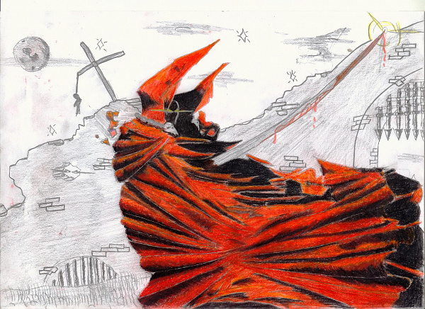
Fanart: Children of the Night
Um Fanarts bewerten zu können, musst du dich einloggen

| [Zeichner-Galerie] | Upload: 19.06.2004 03:23 |
| Inspiriert hat mich "Children of the Night" von "Blutengel": We need your blood We need your flesh We want to see you fade to black Do you like our white skin? Do you like our eyes? Do you want to follow us through the night? We are your pleasure, We are your destiny... We are your pleasure, We are your destiny... We’re living in the the darkness, We hate the day We’re hunting in the night, Take your children away Your blood is our pleasure we want your soul You will never die as a child of the night We’re living in the darkness, We hate the day We’re hiding in the shadow, To the moon we pray We are the creatures of the night, We want your blood We’re the seduction of evil, Want to conquer your world We want to lick your blond We want to kiss your neck Like a taste of sin You will live forever You will never die Come and take my hand We’re living in the the darkness, We hate the day We’re hunting in the night, Take your children away Your blood is our pleasure we want your soul You will never die as a child of the night We’re living in the darkness, We hate the day We’re hiding in the shadow, To the moon we pray We are the creatures of the night, We want your blood We’re the seduction of evil, Want to conquer your world Bitte um Kommentare -^.^- |
Themen: Christian Pohl Stile: Buntstifte Unterthemen: Blutengel |
| Beschwerde |
Kommentare (1)
Von: abgemeldet
19.06.2004 11:35
Hübscher text. ^^
das pic ist hübsch. Dieser starke farbliche kontrast zwischen motiv und hintergrund kommt gut, aber finde, dass du den HG nch hättest bissl mehr ausbauen sollen. ^^"
Diese leichten bleistiftskizzierungen passen irgendwie nicht so wirklich dazu (vom stil her; die linien sind so spitz und genau, ganz das gegenteil vom motiv...), ein dickerer, weicherer bleistift, mit dem man wirklch gut schraffuren/schatten usw machen kann, wäre dabei denke ich besser gewesen. ^^
Aber trotzdem noch sehr schön =))
